[00:00:00]
Dark
Nader Design Group is an architecture, engineering and surveying practice that believes the better way forward is rarely the established one.
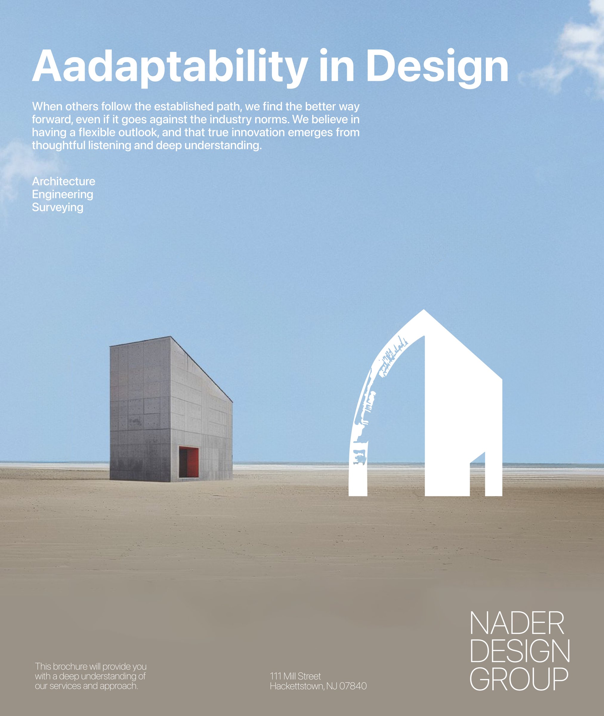
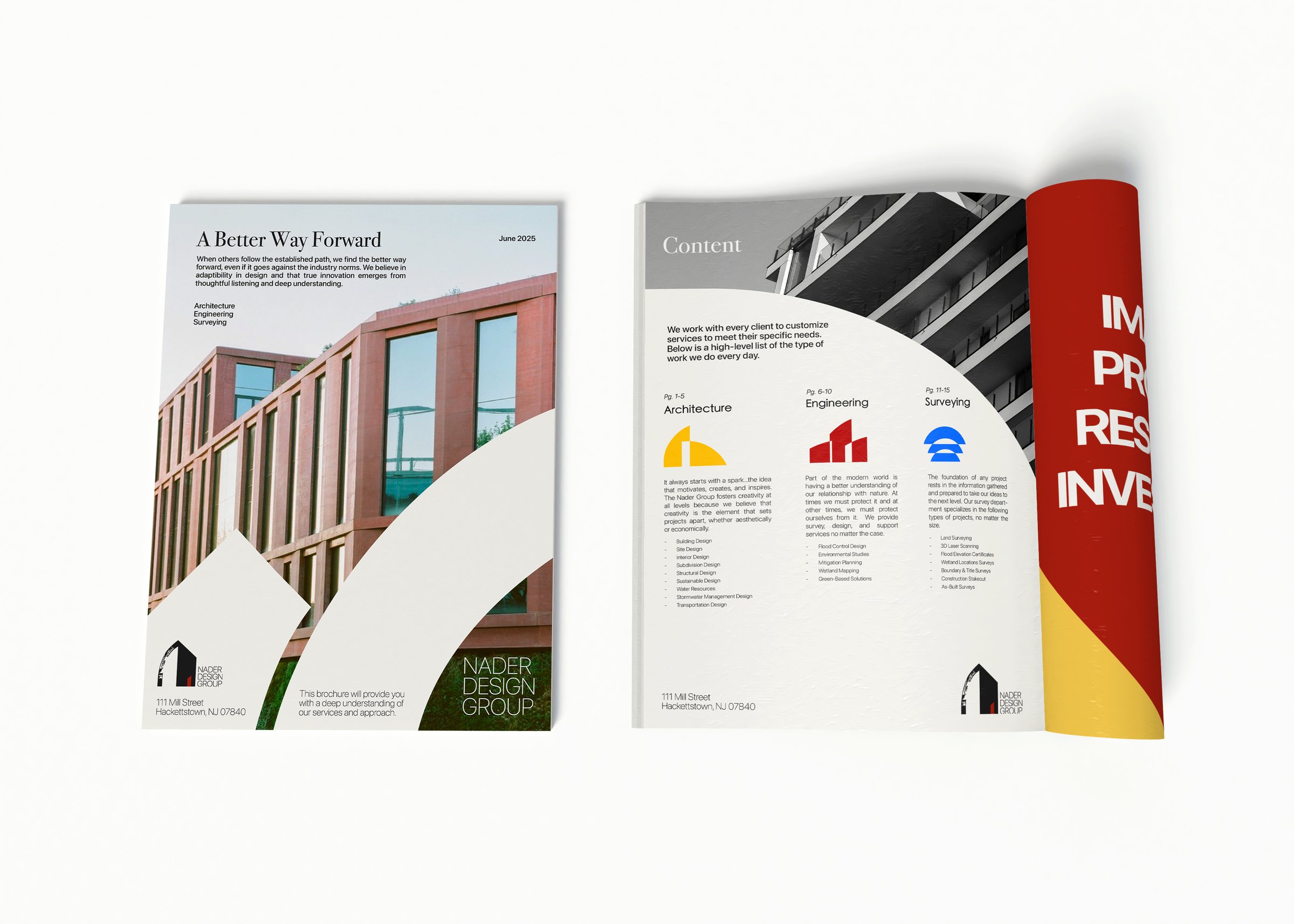
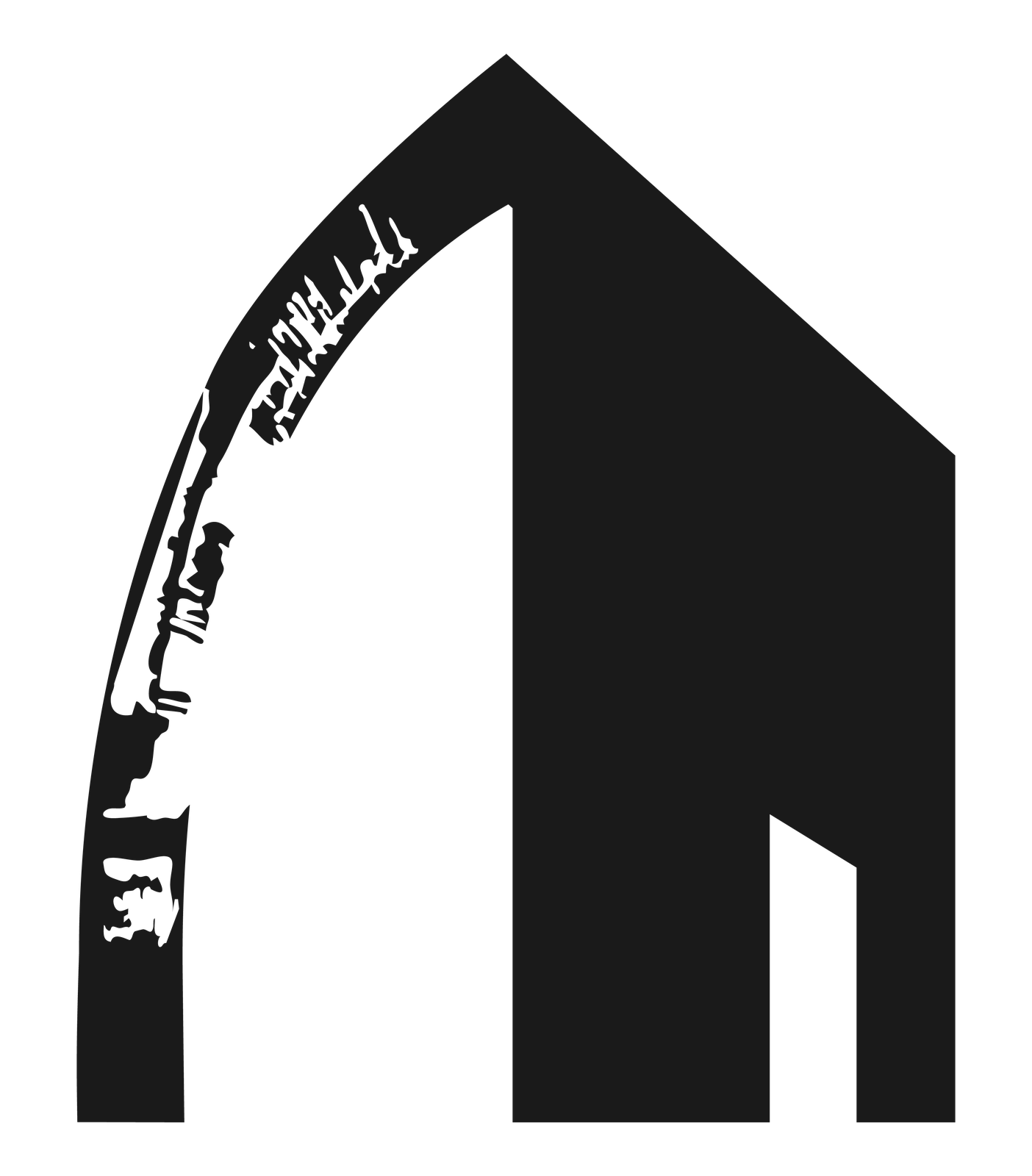
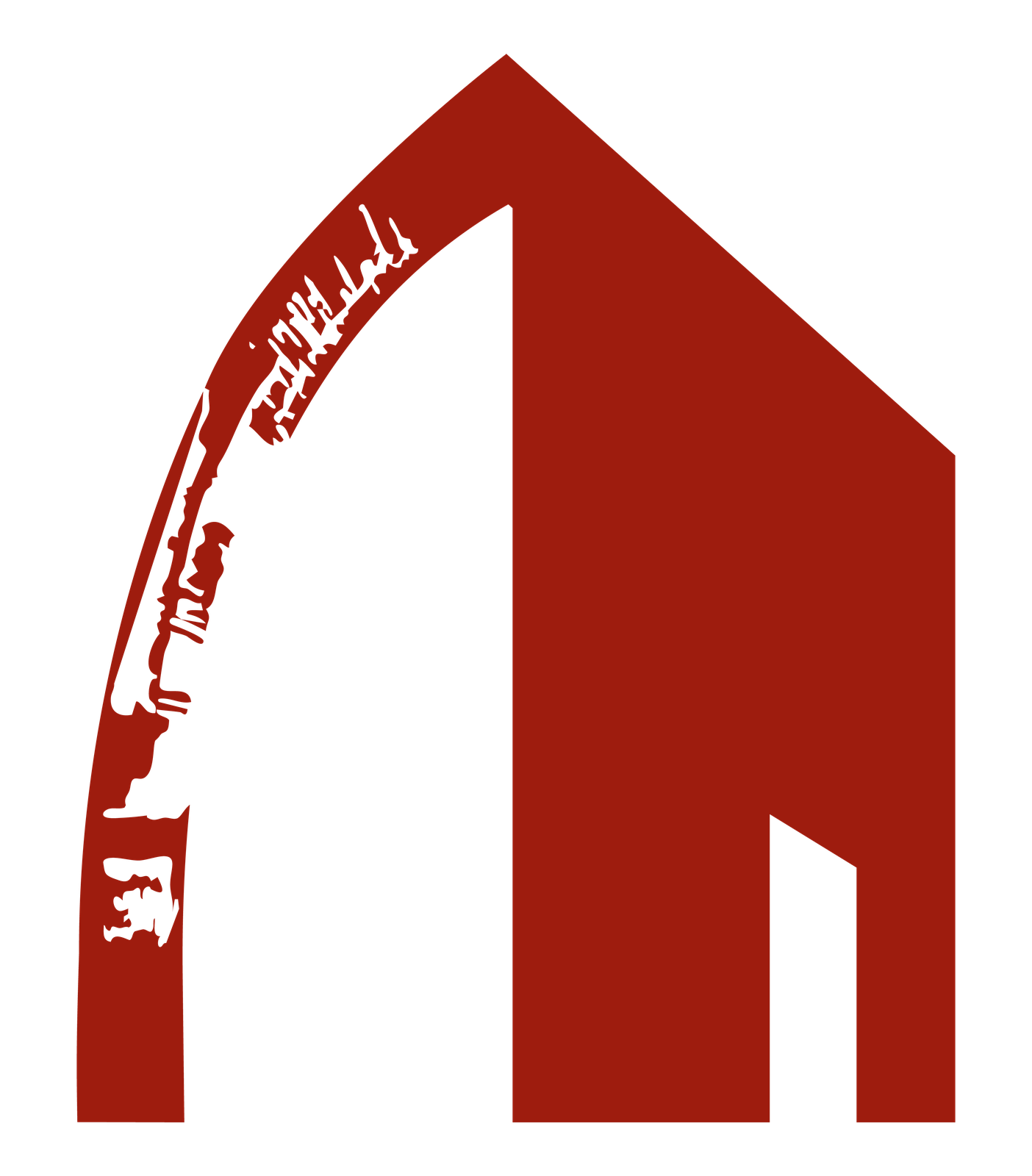
We built the identity around a house mark broken open by a weathered arch, in black with red and gold accents, beside a quiet wordmark stacked in three lines.
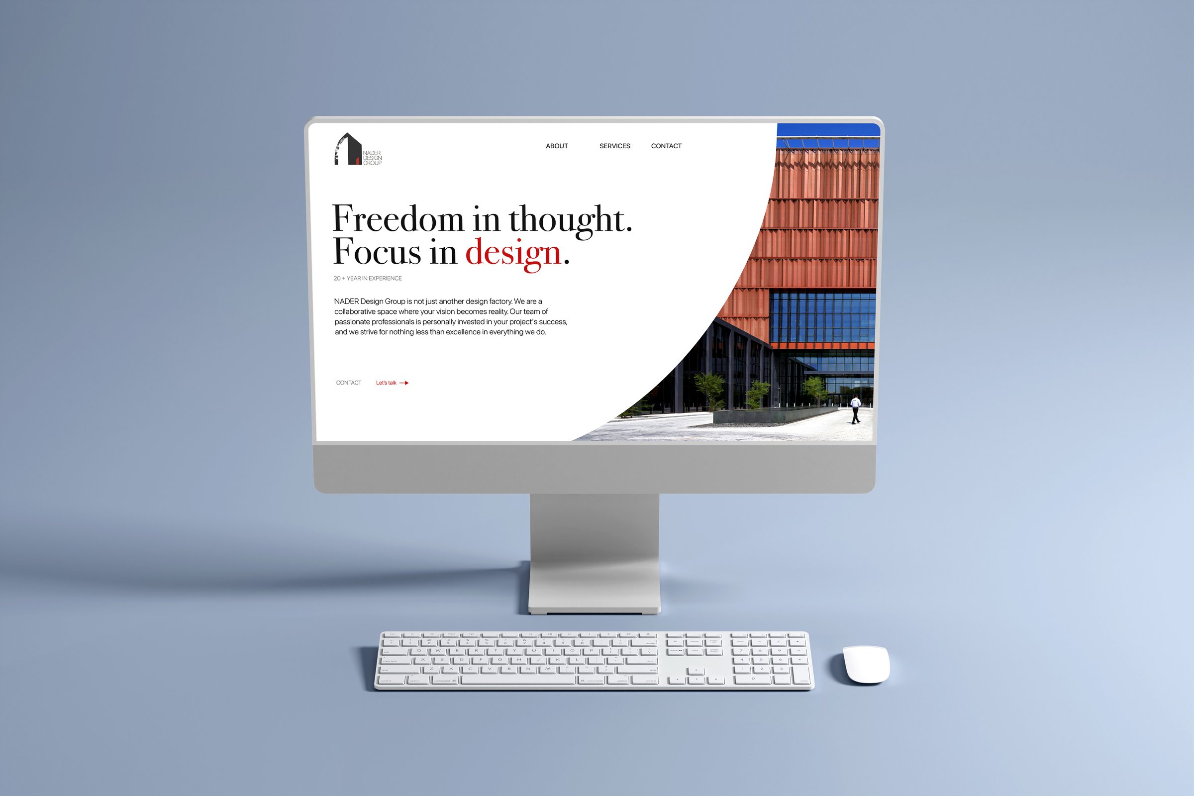
The system carries through brochures, posters and a website that opens on one line: Freedom in thought. Focus in design.
[ CONTACT US ]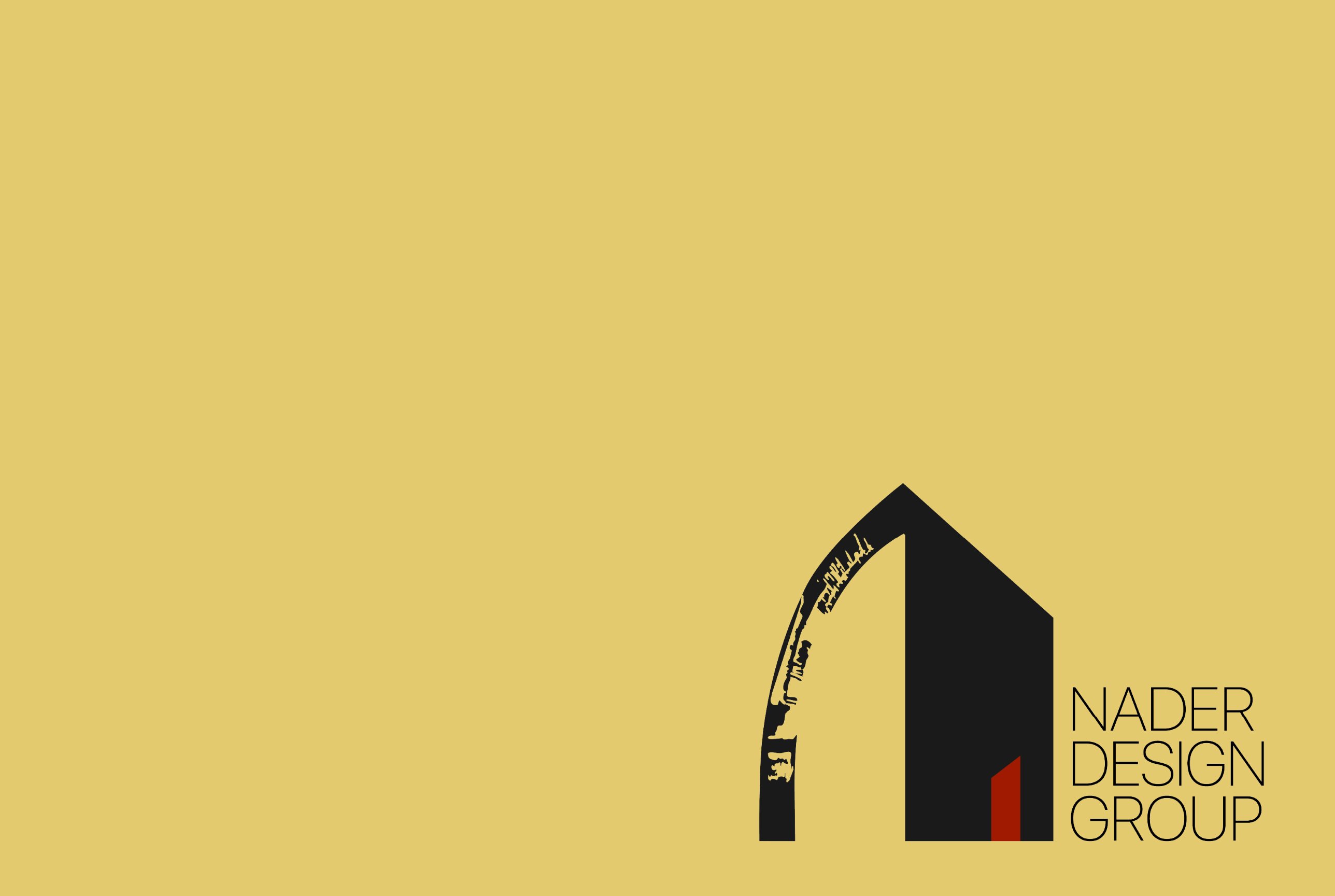
The Nader Design Group
An engineering and design firm in Hackettstown, New Jersey, takes on a new name and keeps the heritage it started with.
Services
- Refresh
- Digital Experience
- Print & Physical
Results
The original logo for Nader House of Design was a drawing of an old church in Lebanon. It carried a heritage they had no intention of leaving behind.
The firm opened in Hackettstown in 2012. Its work now covers civil engineering, surveying, architecture and interior design, for homeowners, businesses and municipalities. The same office might survey a property line, plan a commercial building and work through the interiors of a single home.
When House of Design became The Nader Design Group, the new name needed an identity that could speak for all of that work. It also needed its heritage, the church.
The arch
has room
underneath.
We kept the arch. An arch sends weight outward and down, each stone holding the next in place, which is why so many are still standing centuries after they were built. It belongs to the church in the original mark, and it belongs to engineering. Inside it we set the outline of a house, so the structure and the space it encloses sit in one shape. The engineers and the architects now share one symbol.
The mark also had to hold up at both ends of the firm’s work. It sits behind a municipal proposal and on the cover of a plan for one family’s home, and it reads the same way on each.
For the website, we took the curve of the arch and the lines of the house and set them in motion. Graphic elements pick up the logo’s geometry and carry it through the pages, so a visitor moving from surveying to interior design is still looking at the same firm. The identity then went into print and physical pieces, built from the same parts.
Nothing in the system depends on the firm staying the size it is today. If it adds a discipline or takes on a new kind of project, the arch has room underneath.