[00:00:00]
Dark
Salon Suites by GIGI gives independent stylists a room of their own, and a name worth working under.
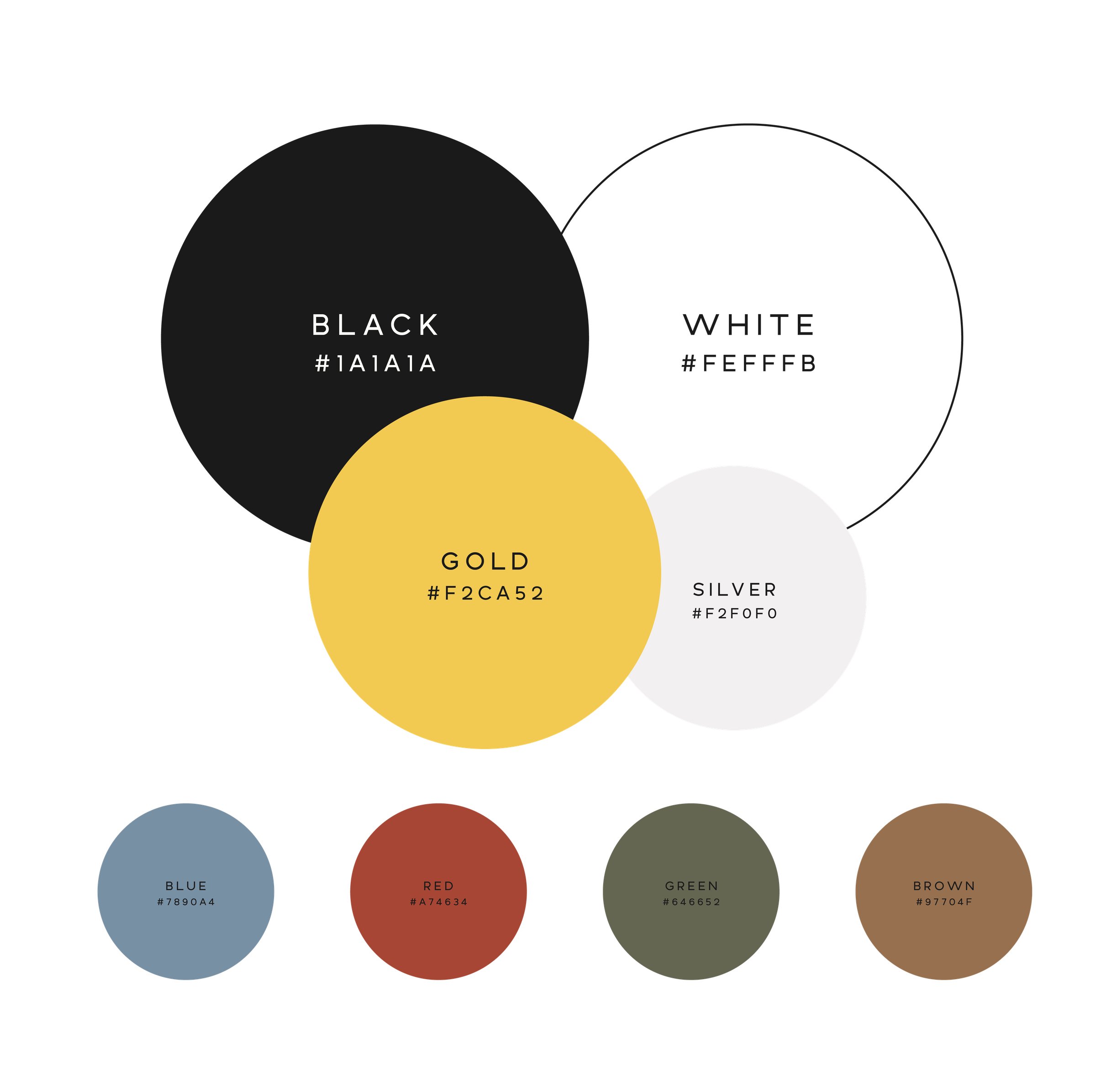
We built the identity from the ground up: an airy, wide set GIGI wordmark, a Polly and Griffin type pairing, and a palette of black, white, gold and silver with four earthy accents.
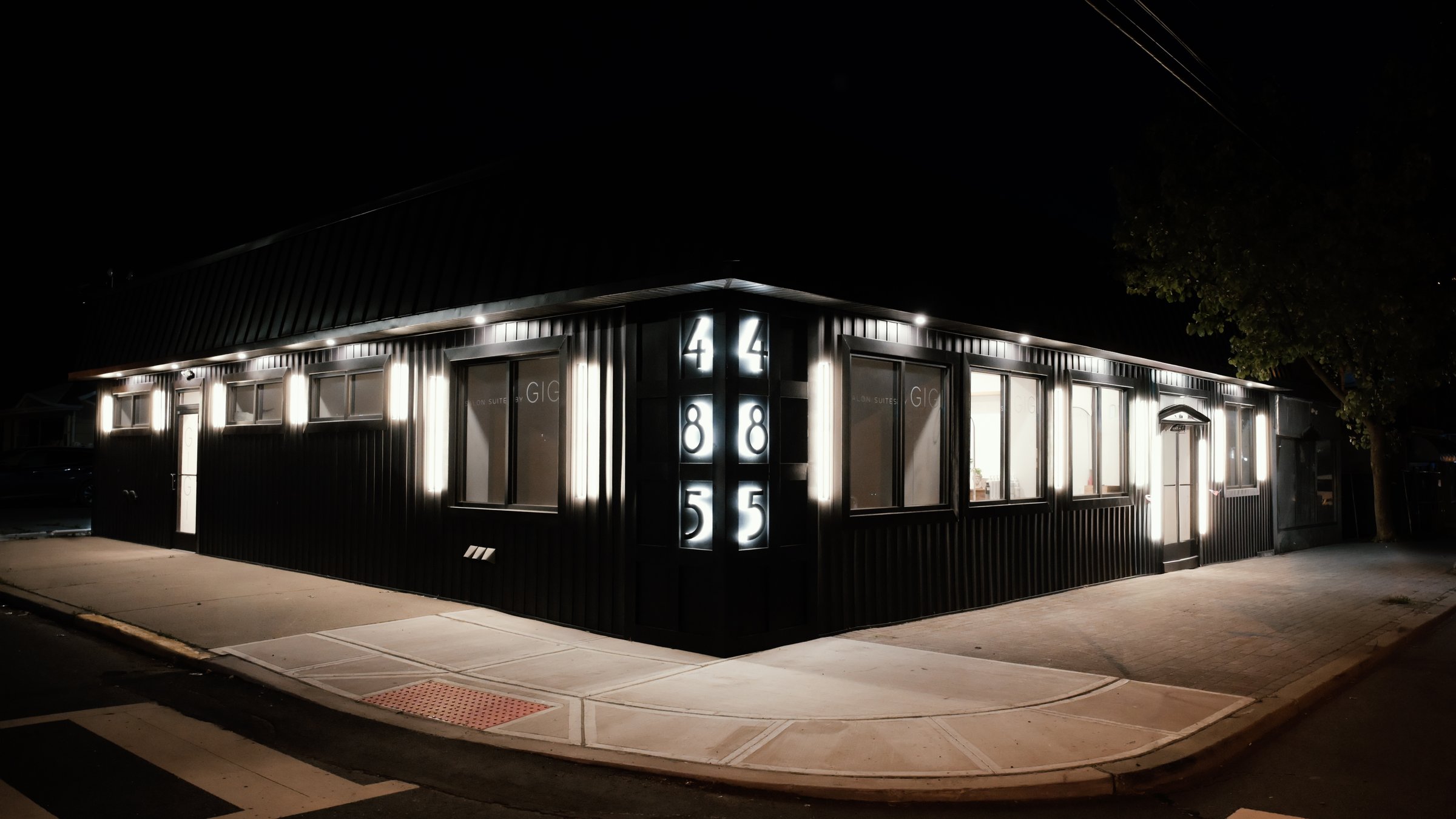
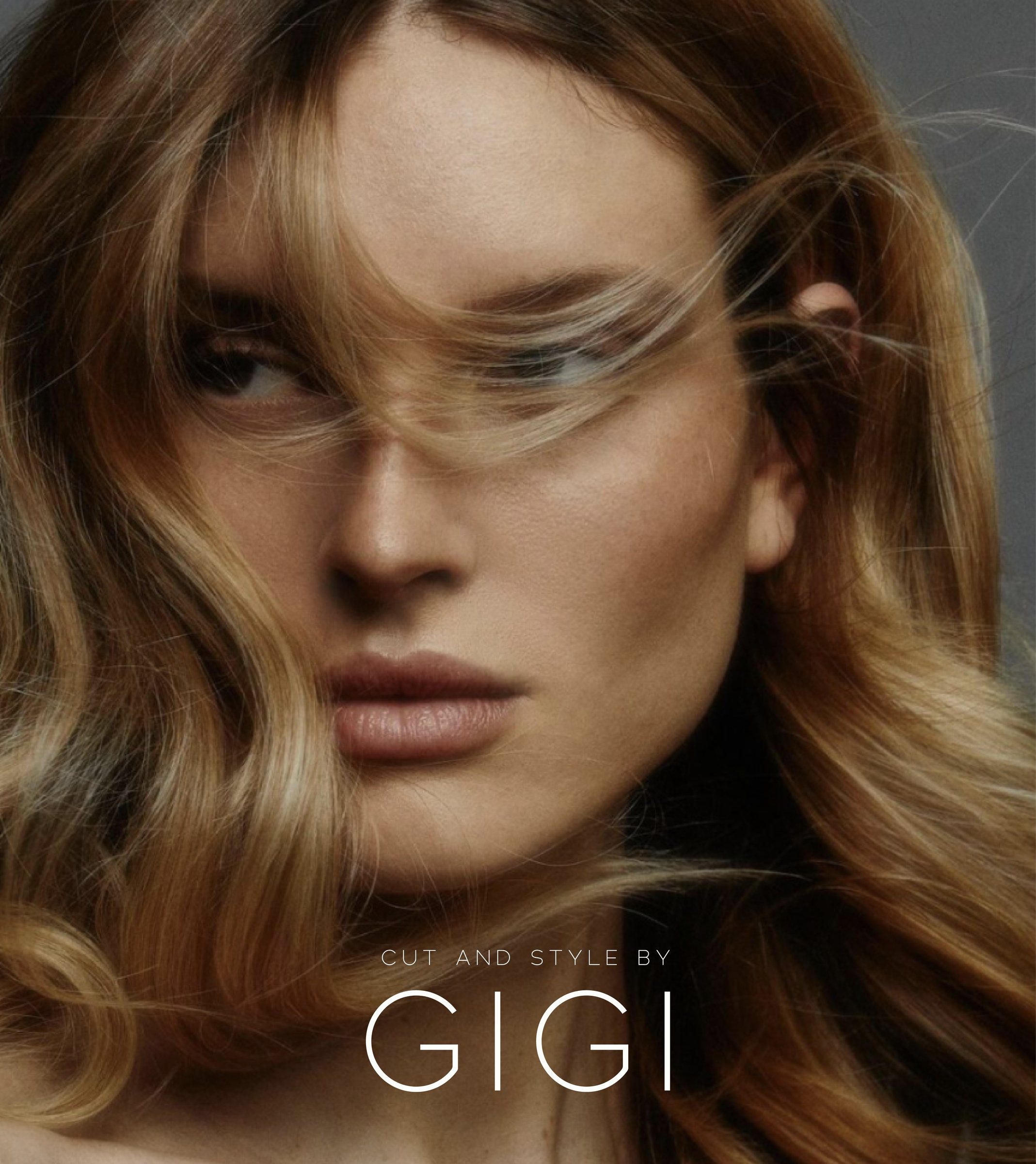
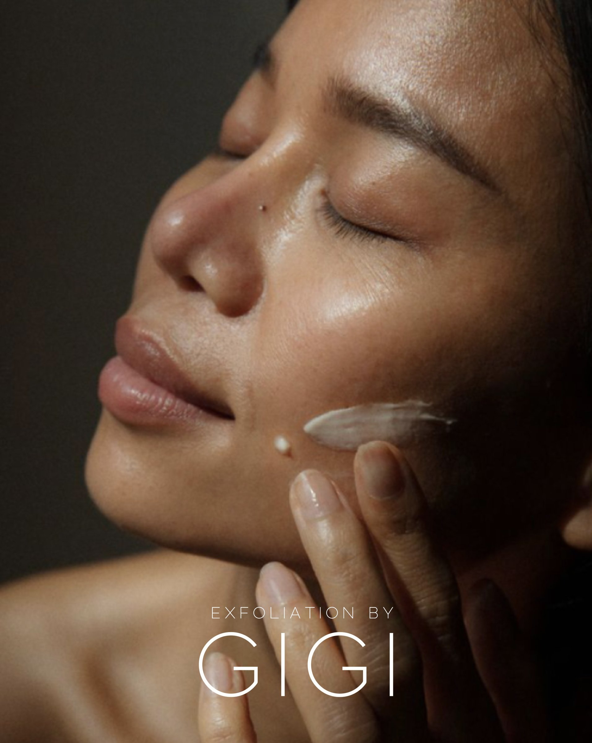
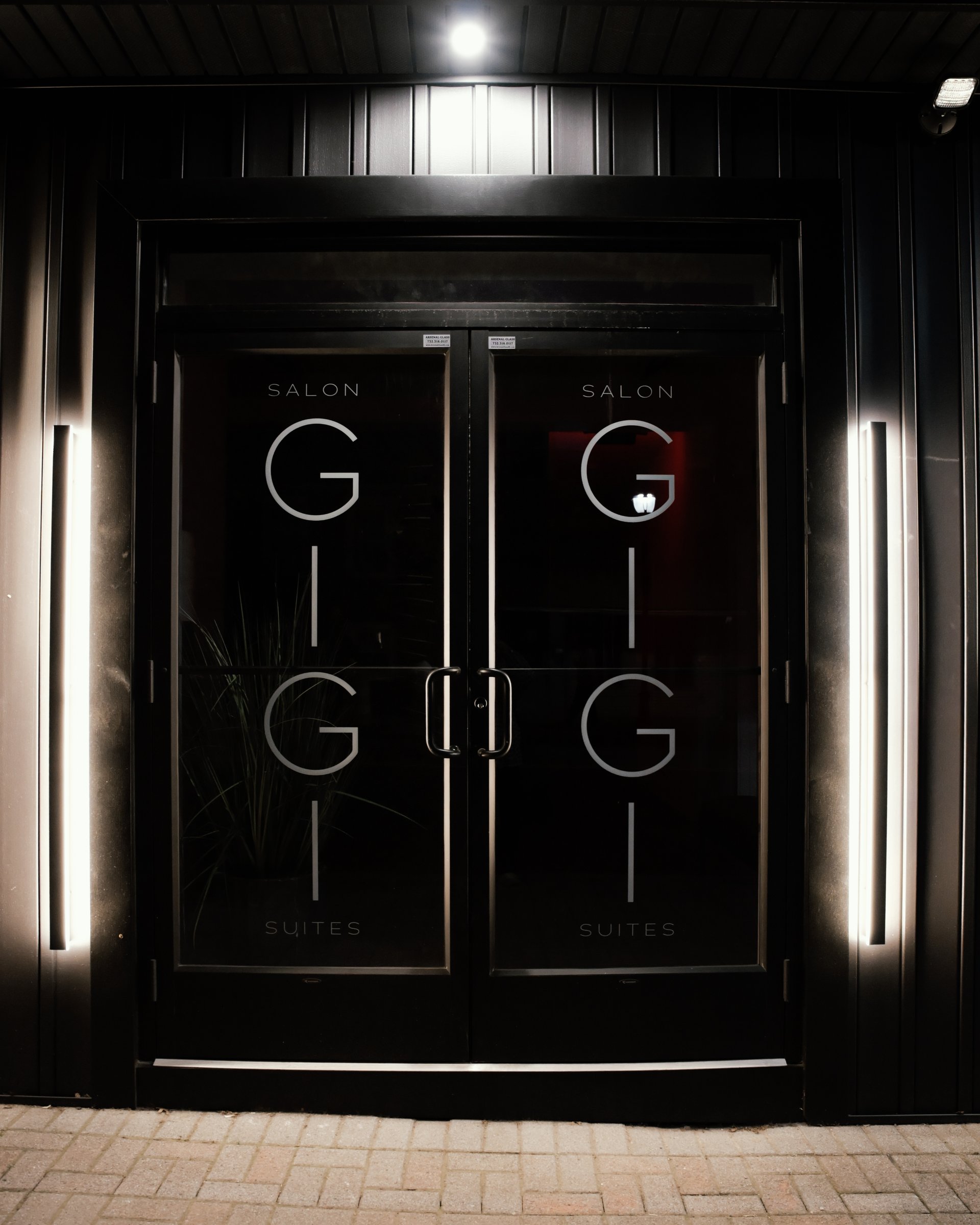
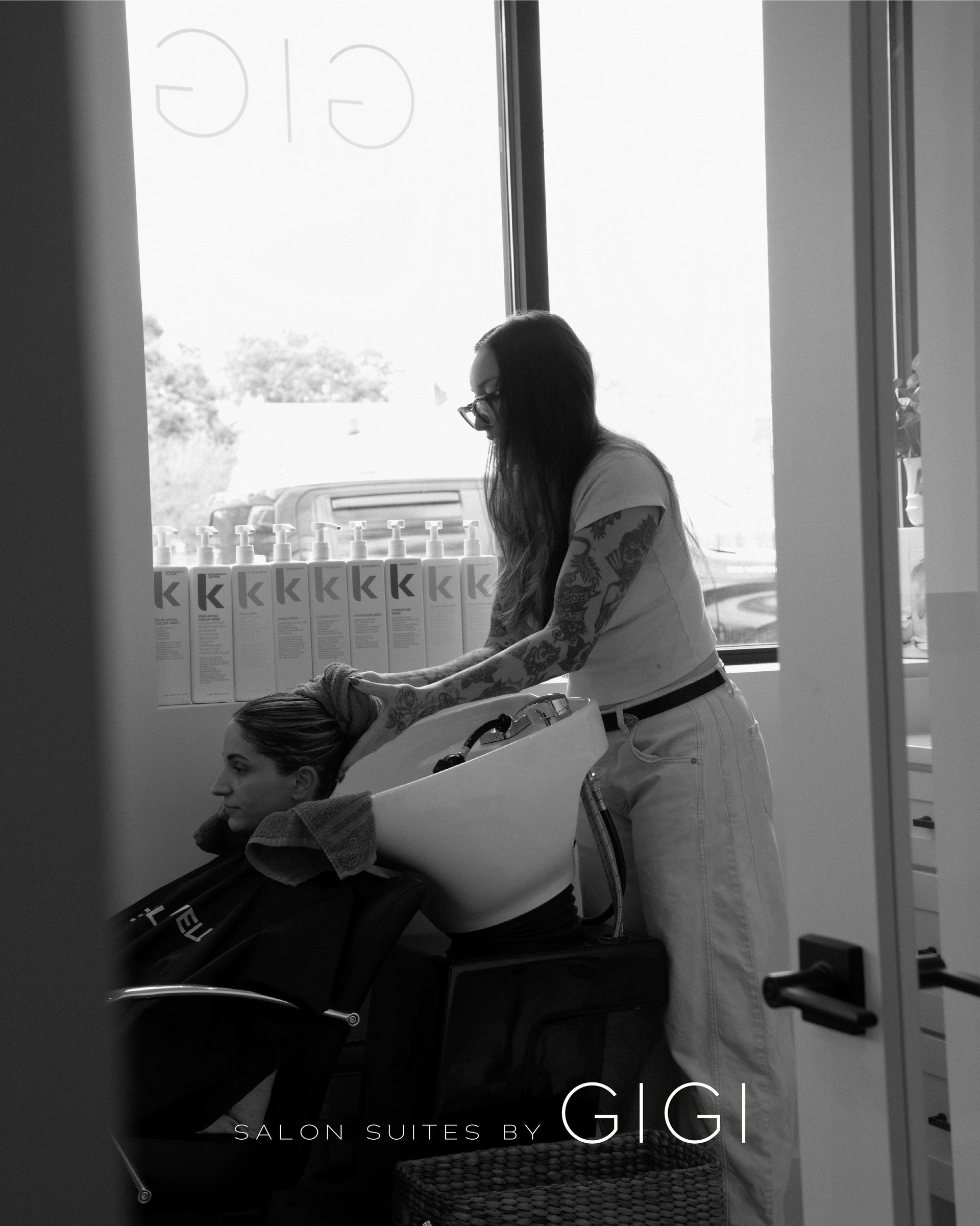
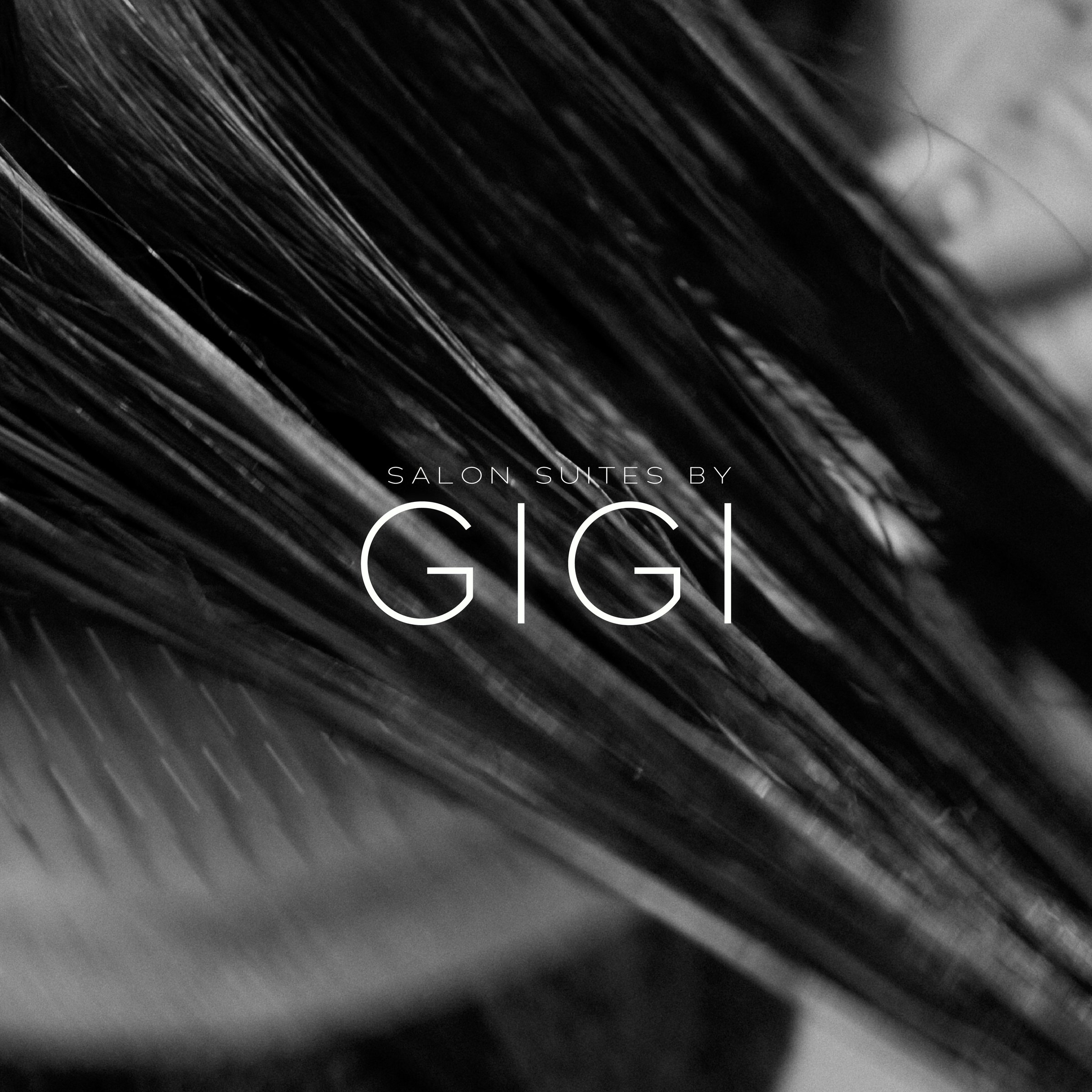
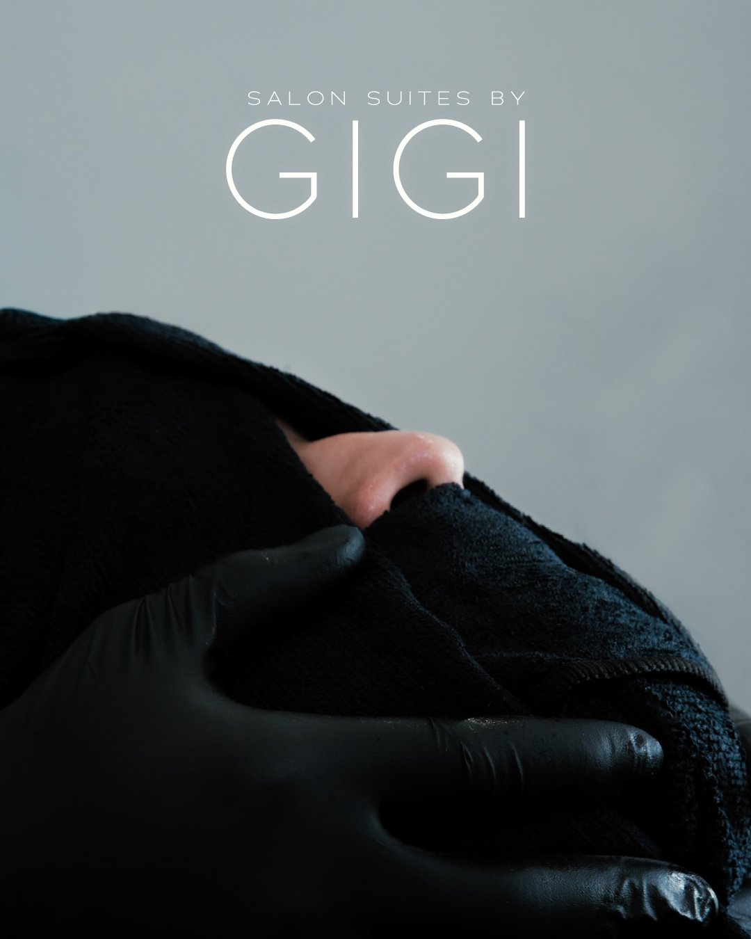
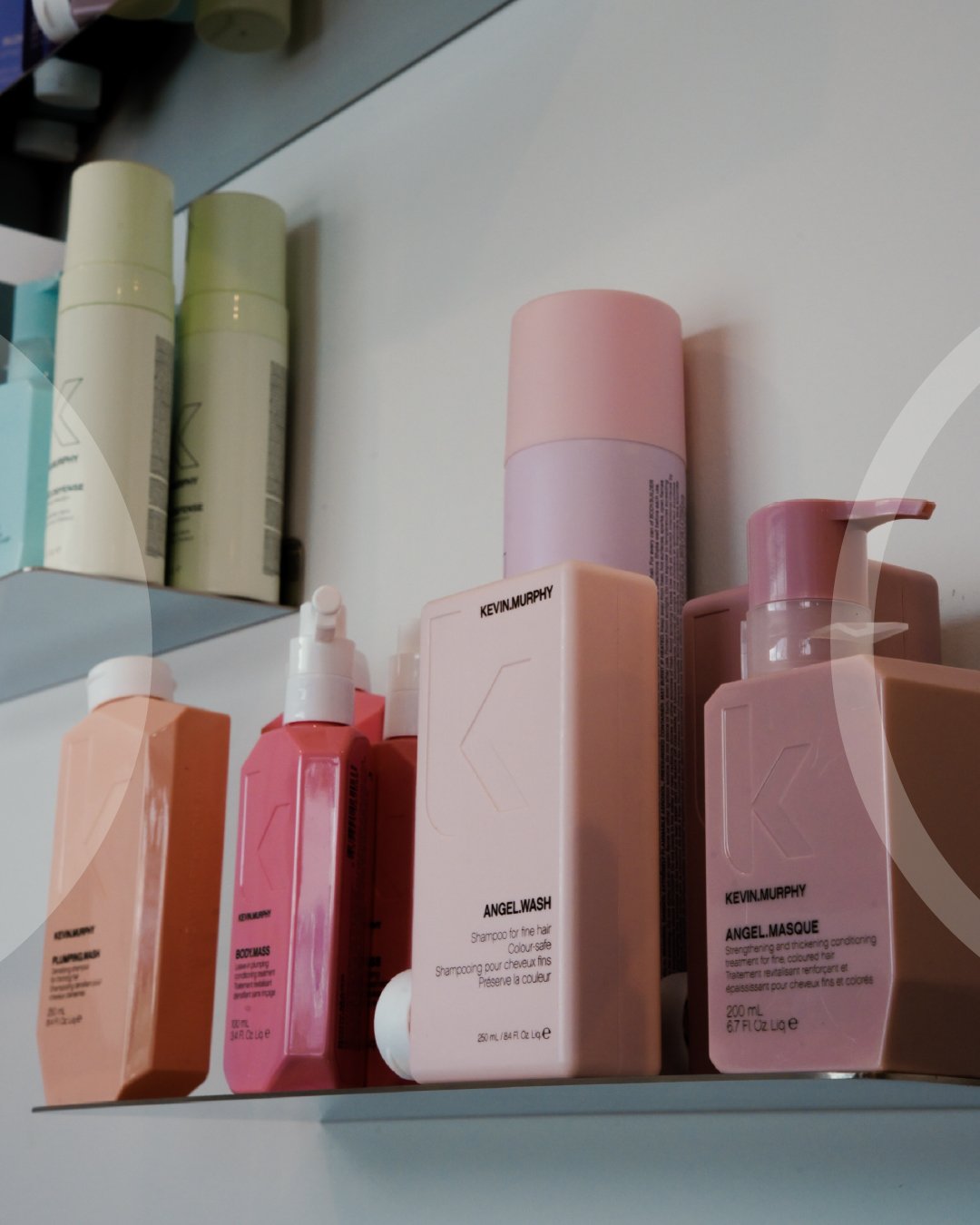
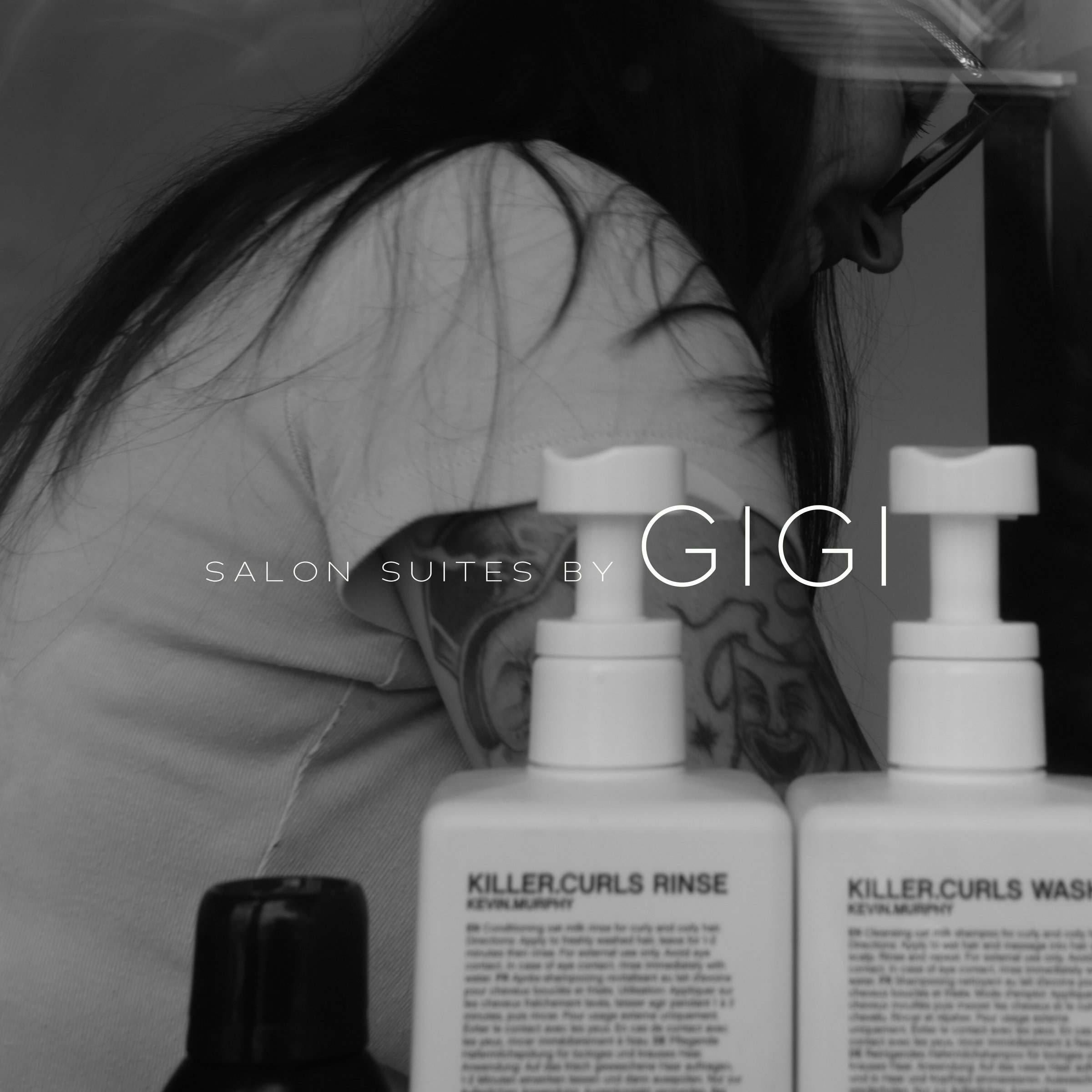
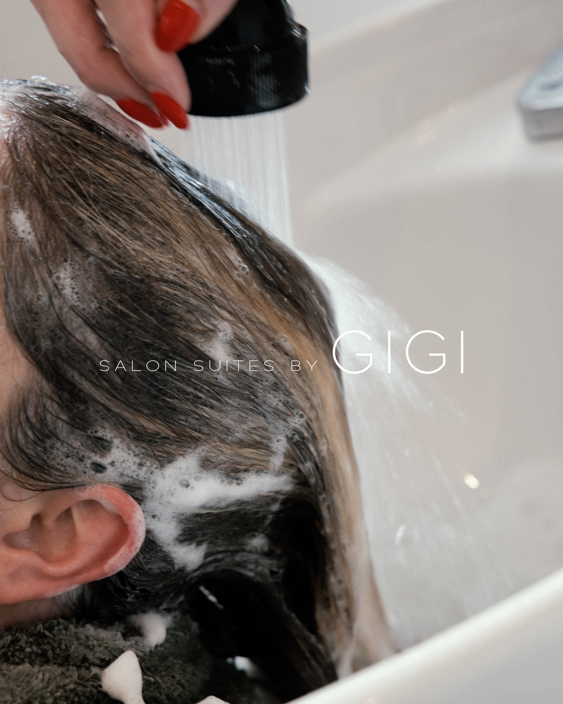
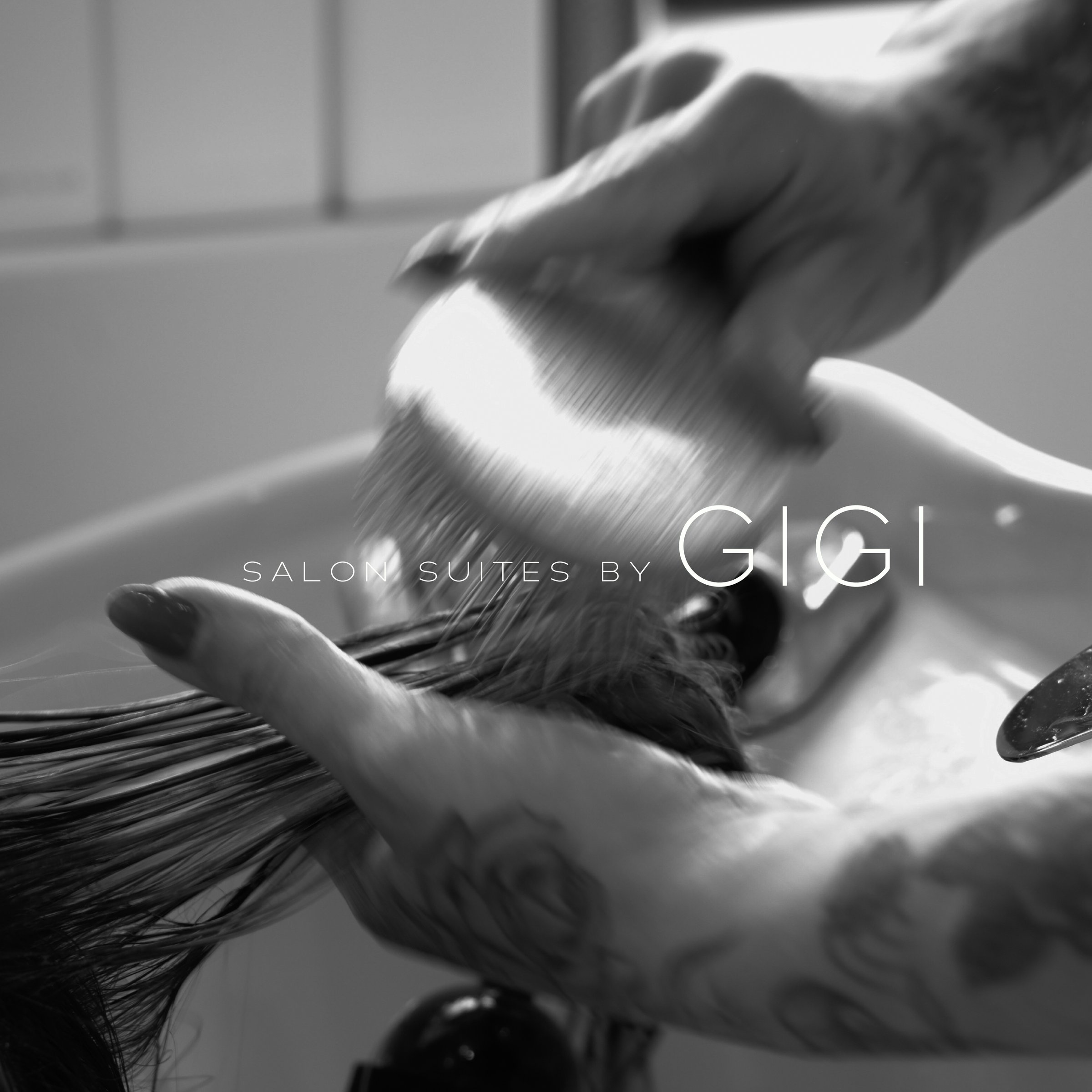
The system runs from the lit storefront and the double doors to a content library of hair, hands and product, with cut and style, massage and exfoliation all speaking in one quiet voice.
[ CONTACT US ]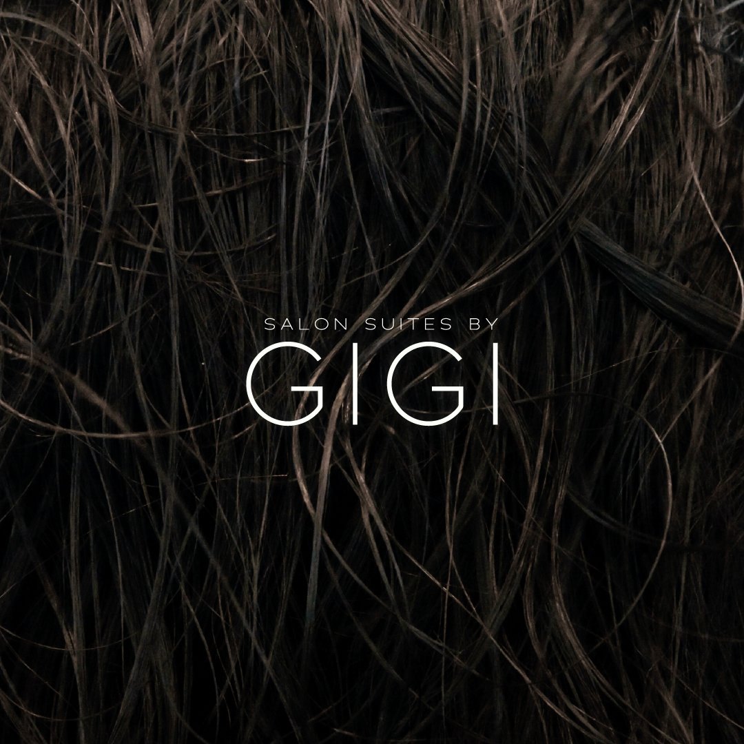
Salon Suites by GIGI
Private salon suites in Fords, New Jersey, for independent beauty professionals.
Services
- Brand Creation
- Campaigns
- Digital Experience
Results
Fords is the kind of New Jersey town where people stay. Neighbors know each other’s kids, the same families fill the same streets, and work is something you do with your hands. The neighborhood feel has never worn thin. In a town like that, GIGI catches the eye, modern and polished, and it came for exactly those people: the stylist who grew up three streets over, the nail tech whose clients are her mother’s friends, anyone ready to go out on their own without going anywhere at all. Most salon suites are anonymous by comparison. The stylist gets a key and a bill on the first of the month.
Inspired by the owner’s granddaughter, the name GIGI turns a business into an heirloom. A family name on the door changes how you look after a place. You’re keeping it for someone. That same respect goes to the beauty professionals who have left the salon floor to work for themselves. Each of them is starting something they can hand down: a client list, a reputation, a business with their own name on it. The more the name is respected, the more it does for those inside.
Building equity, not just renting space.
That’s where our strategy began, with one line: “Building equity, not just renting space.” The equity starts with the name itself. GIGI holds itself to a standard and guards its reputation closely, so that working there says something before a client ever sits down.
Sterile is the default in this industry. We wanted some life in it, so we looked outside to fashion and runway. The wordmark is simple, but it carries a feeling. Black and white, no need to complicate it. There’s a touch of gold, to add some attitude, and a softer set of colors for each of the services. The whole thing feels accomplished and assured, and still within reach for someone on their first lease, just starting their story.
We knew the business wouldn’t stay where it started. The plan moves in stages: first a place where ambitious professionals grow, then suites for established names by application, and eventually a name clients seek out themselves. The identity had to hold at every one of those stages without being redone, so we kept its core simple and left space around it to change.